
Top Interior Paint Color Trends for Delaware Homeowners in 2026
Forget everything you know about interior paint colors. The 2026 paint color trends for Delaware homeowners are shifting in ways that make your space feel fresh and inviting without overwhelming it. From warm neutrals and greige tones to moody blues and earthy greens, these choices can reshape your home’s vibe effortlessly. Ready to see which Sherwin Williams colors are leading the pack? Keep reading to find out! [https://www.hgtvhomebysherwinwilliams.com/en/colors/2026-color-collection-of-the-year]
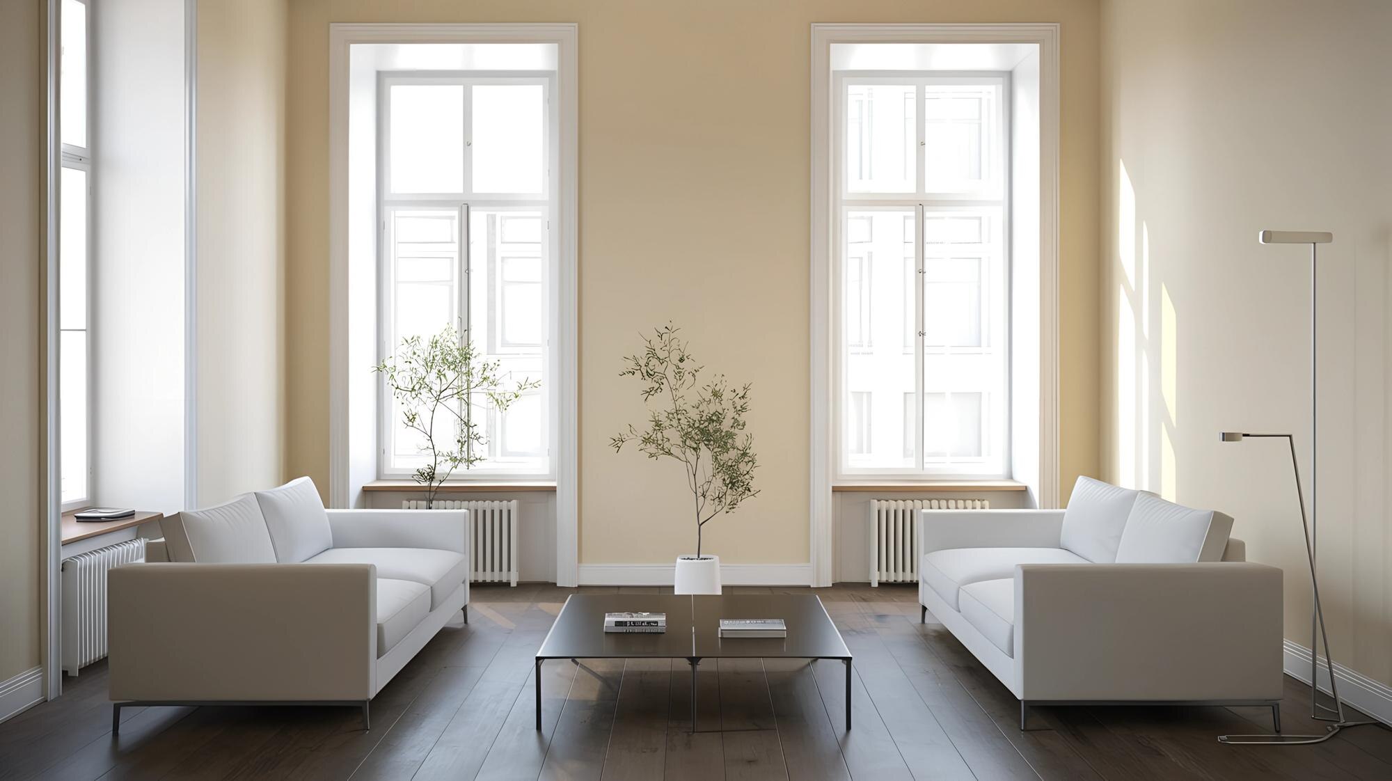
Warm Neutrals and Greige
Let’s start with the warm tones that make any space feel cozy and welcoming. The appeal of these colors lies in their ability to complement a variety of styles and moods effortlessly.
Embracing the Warm Neutrals
Imagine walking into a room that instantly makes you feel at home. That’s the magic of warm neutrals! These colors—like soft beige or creamy taupe—can brighten your day. They create a calm, relaxing atmosphere perfect for any room. Warm neutrals are great because they don’t overpower your space. They allow your decor to shine. Whether it’s your living room or bedroom, these colors offer a versatile backdrop that matches almost any furniture or accessory you own.
The Rise of Greige
Have you heard of greige? It’s an elegant mix of gray and beige. This color is gaining popularity for its unique blend of warm and cool tones. Greige is perfect for those who want a modern yet timeless look. It adapts well to different lighting, transforming your space throughout the day. Imagine waking up to a soft, morning light that highlights your greige walls. By evening, the same walls may take on a cozy, muted hue. This adaptability makes greige an excellent choice for open floor plans or spaces with lots of natural light.
Perfect Pairings for Every Room
Pairing colors can feel daunting, but it doesn’t have to be. Here’s a simple guide to making the most of warm neutrals and greige. In the living room, consider combining greige with navy or teal accents for a sophisticated look. In your kitchen, pair warm neutrals with white cabinetry and stainless steel appliances. These combinations not only make your spaces inviting but also incredibly stylish. With the right pairings, you’ll have a home that feels both cohesive and fresh.
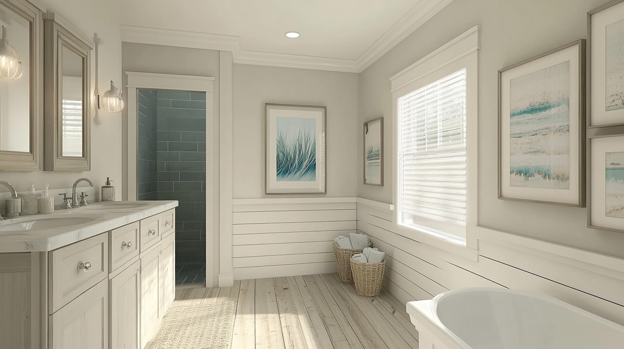
Coastal and Earthy Hues
Feeling like bringing a bit of the outside in? Coastal and earthy tones could be just what your home needs. These colors capture the essence of nature while staying chic and modern.
Coastal Color Palette Magic
The ocean isn’t just for vacations. You can bring that tranquil vibe into your home with a coastal color palette. Think soft blues and sandy tones. These shades create a calming environment, making your space feel like a serene retreat. Whether you live near the water or not, these colors can transport you to the coast. Picture a soft blue wall paired with white trim and natural wood accents. The result? A room that feels open, airy, and perfect for unwinding after a busy day.
Inviting Earthy Greens
Earthy greens are all about balance and harmony. These shades connect your home to nature, offering a grounding effect. Whether it’s a sage green or a deeper olive, these colors have a way of making your space feel intimate and cozy. Adding greenery, like potted plants, can enhance this connection. Greens work well in almost any room, from the bathroom to the dining area. They are versatile and can be paired with wood tones or metallics for a look that is both natural and elegant.
Creating Charcoal Accent Walls
Looking to add some drama without going overboard? Charcoal accent walls can do just that. This deep, rich color can make your rooms feel more structured and stylish. It’s perfect for creating a focal point, like a fireplace wall or behind a headboard. Pair it with lighter colors to keep the room from feeling too dark. Charcoal works well with almost any other color, making it a flexible choice. It adds depth and complexity, turning a simple room into a sophisticated space.
Moody Blues and Low-VOC Options
![]()
For those who love rich, deep colors, moody blues offer a great way to make a statement. Plus, with low-VOC paints, you can do it without worrying about air quality.
All About Moody Blues
Moody blues aren’t just for the bold. These deep blues can transform any room into a sophisticated space. They add depth and richness that lighter colors can’t match. Picture a dining room bathed in a rich navy, accented with gold fixtures. It’s a look that screams elegance and style. But these blues are versatile, too. They can be paired with warm or cool tones, making them a great choice for any room where you want to add a touch of luxury.
Benefits of Low-VOC Paint
Choosing the right paint isn’t just about color; it’s also about health. Low-VOC paints are a fantastic option for anyone concerned about indoor air quality. These paints emit fewer volatile organic compounds, making them safer for you and your family. With low-VOC options, you can enjoy a beautifully painted home without the worry of harmful chemicals. It’s a win-win, offering both aesthetics and peace of mind.
Choosing Sherwin Williams Colors
Sherwin Williams offers a wide variety of colors that are perfect for any style or mood. Their range includes everything from soft, tranquil hues to bold, dramatic shades. Here’s the key insight: choosing the right color can make all the difference in your home’s vibe. Whether you’re interested in warm neutrals or moody blues, Sherwin Williams has something to suit your taste. Their colors are not only beautiful but also durable and long-lasting. So go ahead, explore their options, and find the perfect color for your home.
Leave a Reply